
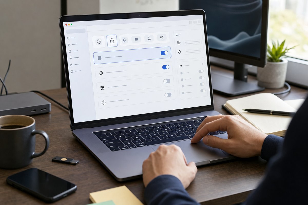
Why settings pages go wrong so often
If you're building software for real customers, your settings page is where good intentions turn into support tickets fast. Teams cram in every option they can think of, label things with internal jargon, and assume users will “figure it out.” Most won’t. Or worse, they’ll change the wrong thing and stop trusting your product.
That’s the core problem behind How to Design a Settings Page Non-Technical Users Can Actually Use: a settings page isn’t just a storage closet for toggles. It’s part of the product experience. For non-technical users, it’s often the exact spot where confidence starts to build—or falls off a cliff.
In my view, a good settings page should help someone answer three questions quickly: What is this? Should I change it? What happens if I do? If your UI doesn’t answer those plainly, you’re asking users to take risks they don’t really understand.
Start with user decisions, not system options
One of the most common mistakes is organizing settings around the way your application is built instead of the way your customer thinks. Engineers naturally group things by service, module, or database object. Your customer is usually thinking in terms like notifications, team access, billing, branding, and integrations.
So map settings to the decisions users actually make. Not “SMTP Configuration”—more like “Email Sending.” Not “SAML and SCIM Provisioning”—more like “Single Sign-On” and “User Provisioning,” if your audience knows those terms. And if they don’t, call it “Company Login.”
This is where a lot of B2B teams need some discipline. Just because a setting exists in your backend doesn’t mean it belongs in your UI. Some options should stay internal. Some belong behind an advanced layer. Some shouldn’t be exposed at all because the product can make the call for the user.
If you’re trying to hide complexity without confusion, settings design is one of the clearest places to prove it. You’re not dumbing the product down. You’re deciding what actually deserves a user decision and what should stay under the hood.
Ask this before exposing any setting
Before adding a control, ask:
- Does the user need to make this decision?
- Will they understand the trade-off?
- Can the product choose a safe default instead?
- If this changes, does it affect only their view, or system behavior for others too?
- Will exposing this reduce support, or create more confusion?
That last question matters more than teams expect. Plenty of settings are technically editable but practically risky. Giving users control over them can feel flexible in a product meeting, but in real life it often dumps risk onto the people least equipped to manage it.
Group settings by goal, not by type
Once you know which settings belong in the product, group them by the user’s goal. That usually means categories like Profile, Notifications, Team, Security, Billing, Integrations, and Preferences. These are familiar, and familiarity lowers hesitation.
Compare that with categories like General, Advanced, System, Configuration, or Miscellaneous. Those buckets don’t do much because they don’t hint at what’s inside. “General” especially has a way of becoming a junk drawer.
Good grouping also keeps users from bouncing between tabs to finish one task. If someone is setting up company access, for example, don’t split that awkwardly across “Users,” “Authentication,” and “Organization” unless there’s a very good reason. Keep the related choices together.
Microsoft 365, Slack, and GitHub all do versions of this pretty well. Their settings can go deep, but the experience is usually anchored around understandable tasks. You may not love every label, but you rarely sit there wondering where to start.
Use progressive disclosure for advanced options
Non-technical users don’t need every detail up front. Show the common settings first, then reveal advanced options only when they matter. A simple “Show advanced settings” link often works better than dropping people into a wall of controls.
But don’t let “Advanced” become the place where vague, risky options go to hide. If something can break login, change data retention, or affect customer-facing behavior, say that clearly.
Teams miss this all the time: advanced for you may not be advanced for the customer. A marketing manager changing the default sender name isn’t doing anything advanced. An IT admin editing OpenID Connect values probably is. Context matters more than technical purity.
Write labels like a person, not a schema
Labeling is where settings pages either become usable or quietly hostile. If your labels sound like field names from a database migration, users will hit the brakes right away.
Use plain language first: “Time zone” beats “Regional localization setting.” “Require two-step verification” beats “MFA enforcement policy.” “Show closed tickets” beats “Include resolved entities in default query state.”
Then add a short explanation under the label when the consequence isn’t obvious. One sentence is usually plenty. You don’t need a mini knowledge base under every field.
Here’s a useful pattern:
- Label: the decision in plain English
- Helper text: what changes when this is on or off
- Optional note: who this affects or when to use it
For example, instead of “Session Timeout,” try “Automatically sign users out after inactivity.” Then add helper text: “Recommended for shared or public computers.” That gives the user enough context to act without making them decode security jargon.
Defaults do most of the usability work
If you only fix one thing on a settings page, fix your defaults. Most users won’t change them. Honestly, a lot of them shouldn’t have to.
A strong default cuts cognitive load, prevents bad choices, and gives non-technical users a safe starting point. If your app sends email, pick a sensible default for notifications. If your app supports file uploads, choose a retention setting that fits your product, industry, and regulatory requirements. If your app has a security toggle, default to the safer option unless there’s a serious usability downside.
There’s a trade-off here. Safer defaults can create friction. Stricter password rules, shorter session times, and extra verification steps may annoy some users. But if your app handles customer data, contracts, financial records, or internal operations, those choices should be deliberate. Convenience shouldn’t quietly win by accident.
For teams on the Microsoft stack, identity settings deserve extra care. If you support Microsoft Entra ID, your settings experience should guide admins toward simpler sign-in and security instead of forcing them to wrestle with cryptic identity terms. “Sign in with your company account” is clearer than leading with protocol names unless the reader truly needs them.
Show impact before users commit
One of the easiest ways to make settings safer is to preview the effect of a change before it’s saved. That could mean showing a sample email, a branded login screen preview, or a short message like “This will affect all new users going forward.”
That kind of feedback matters because settings are often indirect. A user flips a toggle here, but the result shows up later—somewhere else—for someone else. Without context, the setting feels abstract, and abstract settings make people nervous.
For higher-risk changes, go a step further:
- Explain what changes immediately and what changes later
- Say whether the setting affects the current user, all users, or only admins
- Offer a test action when possible, like “Send test email”
- Confirm destructive actions with plain language, not vague warnings
If a change can lock someone out, interrupt an integration, or expose data differently, don’t bury that in a tooltip. Put it near the control so it doesn’t get missed.
Use the right control for the job
Not every setting should be a toggle. Sounds minor, but it affects comprehension more than people realize.
Toggles work best when the change is immediate, binary, and easy to reverse. Think dark mode, email notifications, or showing archived items. They’re a poor fit when the user needs to understand several consequences before changing something.
Use radio buttons when users need to choose from a few clear options. Use dropdowns sparingly, especially when they hide important choices. Use checkboxes when multiple selections are valid. And if entering a value has formatting rules, show an example right in the field.
A classic mistake is using a toggle for something that’s really a policy decision. “Enable account restrictions” tells users almost nothing. A small set of explicit options is better: “Anyone in your company can join,” “Only invited users can join,” or “Only admins can add users.”
It takes longer to design, sure. It’s also way easier to use.
Make save behavior obvious
Users should never have to guess whether a setting was saved. Yet this still happens all the time—especially in single-page apps.
If changes save automatically, tell people. If they need to click Save, make that clear and keep the button visible. Don’t mix auto-save and manual-save patterns randomly across the same settings area unless there’s a strong reason.
And give immediate feedback. “Saved” is fine, but “Saved to organization settings” is even better when scope matters. If saving fails, the message should say what happened and what the user can do next.
This is where thoughtful status design pays off. Good settings pages include loading states, validation messages, and error states that build trust. A spinner by itself isn’t enough. Users need to know whether the system is working, waiting, or just plain stuck.
Plan for permissions and role-based complexity
Settings pages get messy fast when different users have different permissions. Founders and product owners often underestimate this because they spend most of their time in admin mode, where everything is visible.
Your customers don’t.
Some users can view settings but not edit them. Some can change only team-level options. Some can manage billing but not security. If the page doesn’t reflect that cleanly, people assume the app is broken.
You have a few solid options:
- Hide settings a user can’t access when seeing them adds no value
- Show locked settings when visibility helps explain capability boundaries
- Add clear labels like “Admin only” or “Managed by your IT team”
- Explain where to go next if the current user can’t make the change
That last option is underrated. “Contact your workspace admin” is more helpful than disabling a field with no explanation. Better yet, show the role requirement right next to the control.
Accessibility makes settings easier for everyone
A settings page is packed with forms, labels, helper text, and state changes. Accessibility isn’t a side concern here. It directly affects whether people can complete the task at all.
Clear label associations, keyboard navigation, visible focus states, readable contrast, and error messages that don’t rely on color alone all matter. So do larger click targets for toggles and checkboxes. Small controls may look sleek in Figma, but in actual use they’re a pain.
If you want a deeper take, think about accessibility as a product feature. On settings pages especially, accessibility improvements usually make the experience better for everyone, not just users with formal accommodations.
There’s also the less obvious angle: accessible settings are easier to support. When fields are labeled clearly and state changes are announced properly, screen recordings, support screenshots, and guided walkthroughs get a whole lot easier too.
Test with users who didn’t help build it
If your team already knows how the system works, you’re the wrong people to validate the settings page by yourselves. You need someone with the right business context but not the implementation context.
Ask a customer success lead, office manager, operations user, or first-time admin to complete a few realistic tasks. Things like:
- Change notification preferences for the team
- Set up company branding
- Restrict who can invite new users
- Connect Microsoft sign-in
- Update a billing contact
Watch where they hesitate. Watch what they reread. Watch what they refuse to touch because it feels risky. Those moments are usually more valuable than asking, “Did this make sense?” People are polite. Their behavior is a lot more honest.
In my experience, the best improvements usually come from tiny wording changes, better grouping, or one extra sentence of helper text—not a total redesign.
What a good settings page ultimately does
A good settings page doesn’t show everything your system can do. It helps the right person make the right change with the right amount of confidence.
That means fewer mystery toggles. Better defaults. Clear scope. Honest warnings. Labels that sound human. And a structure built around user goals instead of internal architecture.
If you’re reviewing your own product this week, don’t start with a full rewrite. Pick your five most-used settings and test each one against a simple standard: Can a non-technical customer understand it, decide on it, and recover from a mistake? If not, fix those first. That’s usually where the support burden drops fastest.